


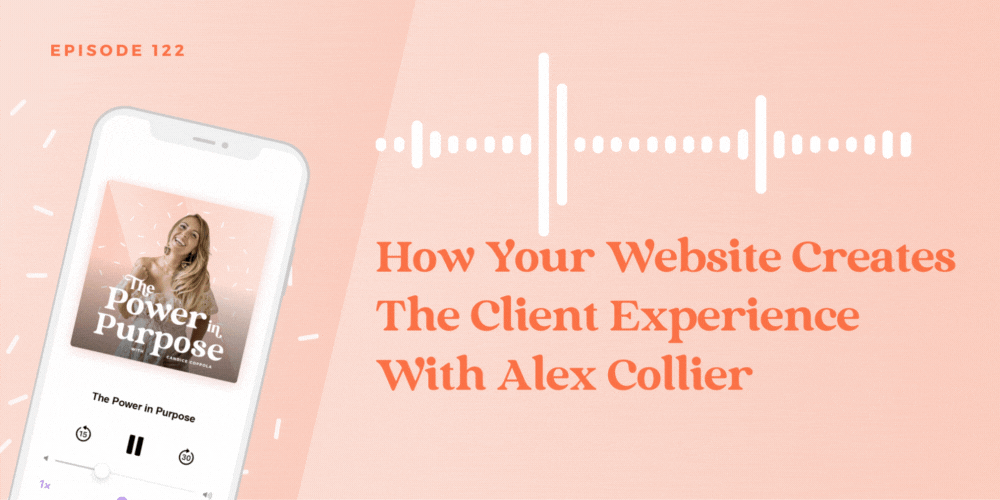
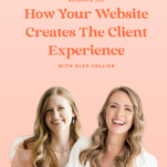
Engagement season is here, and I’m not gonna lie – your website probably needs a little refresh! But before you blow some dust off your homepage and start adding your most recent weddings, I’d love for you to listen to my conversation with Alex Collier. She’s a Showit and Brand designer for wedding pros, and in this episode of The Power in Purpose Podcast, Alex shares how your website sets the tone for your client experience.
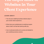
As a business coach for wedding pros, I know how obsessed you are with giving your couples and clients an amazing experience. You invest in software, templates, service providers, gifting experiences, and business coaches to help you make your client experience the best on the block…. but what about your website? What role does it play in your overall client experience, and what does it tell a couple about what life will be like for them once they start working with you?
We answer all that (and a lot more!) in my conversation with Alex today. We chat about how you shouldn’t treat your website like a museum, how to create a better user experience, and what areas of your website actually matter.
Alex Collier has also given listeners of The Power in Purpose podcast a generous discount off any template in her shop. Use the code CANDICE10 and receive 10% off any Alex Collier Showit Template! Click here to check them out.
In this episode with Showit website and brand designer wedding Alex Collier:
- 00:00 Introduction
- 03:10 The Importance of Websites in the Client Experience
- 10:34 Adding Surprise and Delight to the Website
- 13:25 What the Website Tells Clients
- 15:20 How Often to Refresh Your Website
- 17:12 Building Trust on the Website
- 19:33 Adding Personality to the Website
- 23:00 Minor Adjustments for Engagement Season
- 25:18 Using Analytics and Heat Maps
- 27:38 Readability and Typography
- 29:43 Importance of Mobile Version of the Website
- 32:26 Alex’s Services and Template Shop
- 35:15 Conclusion
About Alex Collier
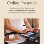
Alex Collier is a visionary brand and web designer specializing in serving wedding professionals. As the founder of Alex Collier Design, Alex is dedicated to creating custom Showit websites and brands that beautifully capture the high-end and heartfelt experiences wedding pros offer to their couples. With a keen eye for design and a deep understanding of the wedding industry, Alex crafts stunning websites that seamlessly blend elegance and functionality. Through her expertise, wedding pros can showcase their unique talents and create an online presence that leaves a lasting impression.
Alex has served many of my clients, creating stunning rebrands and new websites for them – and her work speaks for itself!
Candice (00:00.274)
Engagement season is here and your website needs a little refresh. I'm joined today by Alex Collier and she's going to share with you how your website sets the tone for your client experience. You're here to grow a business, but not just any kind of business. You want to grow a profitable business with purpose. A business where you wake up every single day driven to serve your customers and make a difference in your own life.
I'm Candace Coppola, published author, business coach, and your guide to building a profitable business with purpose. Join me here every single week as we explore how to build and grow your business with purpose. Get ready to dig in and have meaningful conversations about the strategies and techniques that will help you build your dream business. This is the Power in Purpose.
Candice (00:59.918)
Hey there, friend. Welcome back to the Power & Purpose podcast. It's me, your host, Candice. And I thought this is the perfect time for us to talk about websites, what your website might be lacking, what you should be doing to refresh your website for engagement season. So I asked Alex Collier, Show It Designer.
website designer, brand designer for wedding pros to join me on today's episode to talk just about this topic so that you can get your website ready for engagement season. It is November. Engagement season will be here very shortly and this is the most perfect time for you to make some adjustments, to add new work to your website, to audit your website, and make sure that it is
the client experience that you give to your customer. So Alex is gonna explain to us what all of this means and give you some really, really sage advice on how to make your website better. I loved this interview, by the way. Alex said one thing in this interview right at the beginning and I was like, oh man, that is so good. It's gonna get you thinking about your website completely different.
and you're gonna walk away from this episode with a tangible to-do list on how your website can create a better client experience. Now, if you don't know Alex, you should. She's a brand and website designer specializing in wedding professionals business websites. She's the founder of Alex Call Your Design and she creates custom show at websites and brands.
that beautifully capture the high end and heartfelt experiences wedding pros offer to their couples. She has an amazing eye for design. I have several clients who have worked with her, and I can attest firsthand that her work is amazing. She offers one-on-one work. She also has a template shop, so different entry points for you, depending on where you're at in your business and what you have to invest in a new website if you're in the market for one. And she's just amazing and talented and super, super smart.
Candice (03:10.522)
Let's get into my interview with Alex. Alex, welcome to the show. Hi, thank you so much. It's good to be here. I know, I'm so excited to talk websites with you. I think websites are on everybody's mind right now. Everybody's thinking, what can I do to refresh my website? What can I do to add some more razzle-dazzle to my website? How can I make my website more sales focused and more friendly to my ideal clients? And I love your work.
We met. Oh my gosh, it is gonna be almost a year now we met at the creative educator conference. Yes. Yeah. And I love your work. It was awesome. It was so great to connect with you there. I've referred a couple of my clients to you because I think your work is so awesome. They've been so impressed.
with their experience and working with you. So like just a shameless plug, Alex has served my mastermind ladies so well, which is why I'm like, I need to refer to Alex because she's so good. If you're in the market for a website designer, definitely put Alex on your list, but it's great to have you today to talk about websites. Yeah, thank you so much. And I actually love working with your clients because you are such a great coach in the things they talk about that they've discussed with you. I'm like...
Yes, absolutely. That's always all the things we keep in mind with their website too. It's true. Yeah. They come to you with a good base so that you're able to work your absolute magnetic. They do. Absolutely. Well, listen, I'm always tinkering with my website. Alex, as a website designer, are you always tinkering with your website and updating it? Yes, totally. I think that your website is never really done. It's something that you can always come back to and you should be coming back to and updating based on...
things, your data, you're collecting like your analytics, your search console. Um, I actually just revamped my services page, um, just based on, you know, some questions, people kept coming up in sales calls with them and so just kind of trying to like anticipate those questions that I was already getting. And so when you have a well-designed website and a strong brand, it's really easy to kind of make those tweaks and just go in and adjust things as you need to.
Candice (05:08.362)
Oh, I completely agree. For our wedding pros, this feels like the season where they're coming down from wedding season for the majority of people. And they're really thinking, okay, what do I need to do to get myself in front of the right people? And I've got all this new work and weddings that I've just finished. I have maybe new testimonials. I have better accurate pictures of what I can do. And this is the season to get in there.
and just refresh your website. You argue that your website sets the tone for the client experience. And so that's kind of like what we're talking about today is how your website creates the client experience. And so my first question to you is, and you just mentioned this kind of research, what does research tell us about the ways people use and interact with our websites? Yeah, so there is this entire body of research of user experience design, and it's so interesting. There's so many studies.
But one thing we know for sure is that on the internet, people are incredibly goal driven. So you need to be thinking about your website like it's an airport, it's not a museum. People aren't coming to just meander around and take it all in. They're trying to do something and go somewhere. So with engaged couples, they're trying to look at your portfolio, see if you're the right fit. They're trying to see what services you offer, how they can get in touch with you. Planning a wedding is a huge task. It's hundreds, thousands of tasks.
And so they are really trying to accomplish a goal by visiting your website. And we also know that people are trying to accomplish that goal as efficiently as possible. So that's why we see things like how people don't really read on the internet, they scan. It's why people are not very tolerant of frustrations like slow page speed. People are pretty likely to bounce if that's happening on your site. And that's because they're trying to do that very efficiently. So it's our job to make our websites so that people can accomplish their goal and to do that efficiently.
Well, I love what you said that your website is not a museum. It's more like an airport and people are moving through it trying to get to their destination, hopefully that being hiring you for their wedding or whatever it is you do in the wedding industry. It's a really interesting analogy, a powerful visual. I'm visualizing the difference between the two. I think sometimes wedding pros and just business owners in general feel like our website is supposed to be this thing that people linger on and admire and sort of...
Candice (07:23.622)
look at, like they look at the Mona Lisa and have conversations about, and that's not happening. Yeah. Just think about the feeling of being at the airport, right? You're like on a mission. You're like, out of my way. I'm trying to get to my gate. You've got your list of things to do. And also just to put it in context, just think of how many websites you visit in a day. And the fact that when someone is coming to your website, it's one of probably hundreds of websites they're going to visit that day. So just to keep that in mind, I think is always important. Oh yeah. What a great visual though. I think...
That is a huge takeaway for me. I had never thought about it that way. But one thing that I do find myself telling my students about their websites all the time is that people don't read. And so it's important that you build a website for the scanners, the skimmers, and keep that in mind in your website design to make sure that your message is translated for all of us who are skimming trying to find the information we're looking for. Yeah, absolutely. Yeah.
So how do we guide our ideal clients or the visitors on our website through an experience? Yeah, so I think that the lens you want to be looking at this through is you want to be making your website as easy, friction-free and delightful as you can for your visitors. And if you're thinking of it through that lens, then you're going to create an amazing user experience just by thinking of it that way. So I love that you mentioned people scanning and that's, I think, a huge one because you need to be guiding people's reading. You need to be their guide through the website.
So you need to be putting the important content in your headings. That's what people are going to be reading as they scan down the page. You need to be thinking about not making your paragraphs super huge because people are not going to read that. And you need to tell people what to do. So be their guide, make your calls to action super clear. Tell them what page to go to next. Yeah, great tips. Do you think that for wedding pros,
I think they have sometimes this belief that they can only say something once on their website and that information can never appear anywhere else. And they constantly have to reword things or come up with something absolutely original from one page to the next. Do you think that's the case or do you think that they should be repurposing text and information about their business throughout their website? Yeah, totally repurposed because you're right, people are probably going to miss it the first time or maybe even the second time.
Candice (09:43.006)
or someone might not even come to your services page, they might go to your homepage, straight to your contact page, they might skip over that entirely. So the more you can kind of reiterate things throughout your site, I think the better. And I do think it's nice to kind of switch it up and not have it be word for word necessarily, but I definitely don't think you need to worry too much about making it super original and different from the rest of your site. I think just some small tweaks.
Can can go a long way. What would you say are some things that we can do to make our website more delightful? So we know there needs to be like this Utilitarian aspect to the website and it needs to be built for the skimmers Also the people who are looking for specific information. So making sure your website Actually delivers the information is not vague. It's very specific to what people are looking for But how can we add some more like surprise and delight? Yeah, that's a great question. So there's actually a
effect, I guess, in user experience design called the aesthetic usability effect, which is that people actually perceive aesthetically pleasing designs as being more usable. So that's why things like your font choices, your color palette, those kind of like branding pieces are actually really important when it comes to your website, because that does create that aesthetic experience for people, which people do really value. And also, I think if you think about points of entry on the page. So
This is kind of going back to my high school journalism nerd days, is that when I was on the high school magazine, we talked about in a magazine layout, you have different points of entry to an article, right? You have people don't just start necessarily at the first paragraph. They look at a picture first. They look at a pull quote. They look at a little sidebar with statistics that pulls them into that article and makes them want to read more. And I think it's the same with your website where not everyone is going to see that heading and decide to read that paragraph. Someone might look at the picture first or look at, you know, your little...
brand mark in the corner first, and that might grab their attention. So I think those are the things that kind of create a more layered and immersive experience and do create that delight. I can't underscore enough, like your font choices and using typography as a design element, but also using it as a way to communicate what you want to say to people. One of my biggest pet peeves on Wedding Pro websites is where like there's no consistency in font. There's no like...
Candice (12:01.09)
brand guidelines or rules being followed. So what I mean by that just as a visual perspective is like you look on someone's website and the paragraph font is jumping around from different type faces to different sizes to different colors and there's no consistency. And then if you go on somebody's website where everything has a rule applied to it and the rules are followed throughout the whole website, to me that just develops trust instantly. I feel like instantly this person is more trustworthy because things feel organized.
and they feel like professional. Yes, there's a level of consistency that's super important. Yeah. And so, I mean, I know that when people like purchase templates and they DIY stuff, sometimes things can get really lost and funny as they're like editing their website. So just something to keep in mind, but it's something that I see a lot. I'm gonna ask Alex what her pet peeve is towards the end of this episode that she sees on Wedding Pro websites all the time, but that's my biggest pet peeve. And anybody's website I've critiqued, they know that.
I think you'll find mine is probably pretty similar. Similar? I'm excited to hear. So here's an interesting question for our listeners. What is their website telling their clients that they don't even realize? So what is their website saying about them, their business or services that maybe is subliminal? Maybe they don't even realize it's saying this thing. Yeah. So you kind of already mentioned how I talk about, I think your client experience doesn't start when someone signs on the dotted line with you, right? I think it starts.
the first time they encounter your brand, which a lot of times that might be your website or your website's going to be one of the first things they encounter. So your website is telling them what it's going to be like to work with you. So in a few different ways, right? It's gonna tell them, are you easy to work with? Are they having to jump through a million hoops on your website to figure out like, are you in budget? How do they contact you? How do they set up a consultation call? That speaks to what the experience of working with you is going to be like. Your attention to detail is another huge, huge thing.
you know, things like spelling errors that are so easy to overlook. Like how many times have I seen the word stationary spelled incorrectly on a wedding pros website? You know, if someone is putting their trust in you for their wedding, and they want that attention to detail to be on point. So if you're not having that attention to detail on your website, I think you're kind of planting a seed of doubt. And like you said, um, affecting that level of trust. And then also, I think it's totally communicating your aesthetic taste, kind of like we already talked about if your website looks like it was designed 10 years ago.
Candice (14:23.514)
I think that's going to make people think, oh, is this person, their aesthetic taste is stuck 10 years ago. Like, that's going to be what they're going to do for my wedding too. So I think you definitely want all of those things to be on point. Yeah. What a great point there about the age of your website. Because I think we can naturally, especially as a couple doing their research and they're going to many websites and seeing all different types of vendors from a variety of different categories, they can pretty much instantly tell somebody's website.
that was done five years ago or 10 years ago versus something that's fresh and new. Yeah, totally. And I think there's elements of design that I think can stand the test of time. Same with weddings, with the actual color palettes and florals and everything with a wedding. But for the most part, I do think there's some things that need to get freshened up every so often because things do get dated. How often should we be doing more than a refresh? When I consider a refresh, adding new pictures, maybe adding a little...
extra doodad to it, a little razzle, dazzle, a little something, but really overhauling or just really stripping things down and starting fresh. How often should we be doing that? Yeah, I think that's going to totally depend on what trendy versus timeless elements you did include in your original design. But for the most part, I would say probably around four to six years, maybe less is probably a good kind of ballpark of how often I would think you would probably be wanting to do a full revamp.
And I don't think that necessarily means your branding needs to get revamped, right? I think that your website and your brand definitely go hand in hand. And, you know, a lot of designers, me included, would do those services together. But if you have a strong brand foundation, then your website can kind of evolve hand in hand with that. Yeah, I would agree. And it does really depend on your branding to begin with, too, and how you feel about your website. I think you should feel really proud to send that link out to people.
and almost in love with it, you know, like in love with your own reflection. You just, you'd love to look at your own website. You have that sense of pride. And when that begins to wane, I think that's a good indication that at least you should go in and do a little sprucing up. But if you're not proud to send your link out, that's a good sign that it's maybe time for a full refresh. Yes, I think so too. I think it's like a gut feeling. Like, yeah, if you feel slightly embarrassed to send someone to your website, then it's definitely time to think about revamping things. Yeah, 100%.
Candice (16:43.594)
What are some misconceptions about the best way to build trust on your website? We know through marketing there's this concept of the no-like and trust factor, and in order for somebody to buy from you, they have to move through this into the trust phase. So what are some ways that we can, what are some misconceptions about building trust, and then maybe what are some ways that we should be focused on building trust? Yeah, so I think the best way you can be building trust on your website is by creating that easy, friction-free, delightful experience. I think that's showing people that they can put their trust in you.
In the wedding industry, what I see a lot is I think that people tend to put an over emphasis on social proofs, so things like press and testimonials. And that's not to say that those things are important because they certainly are, so please don't go, like, delete those from your website. But I don't think those things are actually creating or building trust. They're more like supporting evidence for the trust that you are creating and being really transparent with people and things like, for example,
showing your pricing. I know that's like a hot debate about websites. It's always something people love to ask about. And I think if you're viewing your website through the lens of wanting to create this easy experience for people, then you will put at least some sort of, you know, starting price, average price, because that is what couples really want to see. Hey there, friend. Real quick, I want to share with you how you can sign up for a free trial with HoneyBook. HoneyBook is everything you need to get...
business done and it's trusted by over a hundred thousand independent businesses just like yours to manage projects, book clients, send invoices, and most importantly, get paid. If you've been looking for an all-in-one solution to manage your customers, I want to invite you to sign up for a free trial with HoneyBook. Go to CandaceCoppola.com slash HoneyBook.
to learn more. And when you sign up for a free trial using the code purpose, you'll save 50% off of your first year's subscription. HoneyBook is what I used in my business as a wedding planner, and it helped me land every single sale. It's what helped me build a six-figure wedding planning business. It's also what helps me today in my business. Go to CandaceCoppola.com slash HoneyBook to learn more.
Candice (19:05.674)
And with the code purpose, save 50% on your first year's subscription. Do you think that a way to build trust is also maybe to sprinkle a little personality into your website or to be more of a human being, like share more about you as the owner and even if you have a team, like just share more about you personally rather than keeping things so professional or corporate feeling?
Yes. So I think that showing your personality is super important. I think that comes across in things like your branding, your fonts, your colors, but then also, yes, like showing a picture of yourself, showing a picture of yourself actually looking and making eye contact with the camera, um, psychology wise, that's super important because eye contact is everything. Um, and then also something I see a lot is that people will use the word we on their website to refer to their business if it's not a team, right? When it's just them.
And it's kind of, again, making people maybe subconsciously think, like, who is we? Maybe there's some lack of trust there because you're like, you keep talking about we, but it looks like it's just you. So what's the deal here? So I think, yeah, just not being afraid to say I, like be personal if it's a personal brand. Yeah, I agree with you. There's nothing wrong with you being your business and there being no we, you are we. There's nothing wrong with that at all. What about... I always recommend...
for the women that I mentor my students, I'm like, listen, we need to put a little bit of personal hobbies. We need more of this information. It feels inconsequential. It feels maybe even silly to say, hey, my favorite Starbucks order is this, or my favorite rapper is this. But in actuality, it creates connection with people and they can maybe find something in common with you, which is really kind of.
important these days in establishing trust and creating client connection? Yeah, I think so too. And I think that maybe a couple years ago, we were kind of swinging the pendulum too far on the other side of that where people on their about pages, it was kind of like the whole about page was like, here's my coffee order. When it's like, your about page should really be about your business and about making that connection for them of why you're the right person to serve them in their wedding. But I do think you're right. There needs to be something on there that's making that personal connection. So I have a section on my about page that's like...
Candice (21:24.138)
when I'm not designing, here's some things I'm doing. I have a picture of me attending the Arrows Tour on there. All the time people will tell me like, oh my gosh, I'm a huge Taylor Swift fan too. So there is that level of personal connection that's really nice. Yeah, it is nice. I think it helps to create better client relationships in the long run. It helps to pull your people to you as well.
And then maybe even repel people who are not interested in the same things that you're interested in, which is totally fine actually in many respects. It's probably better they find somebody who personality wise feels more aligned. Yeah. I think your website should definitely be repelling people. I think people complain a lot about ghosting. But I think that's what happens when your website doesn't repel is that people who are not a good fit inquire.
and they don't realize that they're not good fit until after they've already inquired. Whereas if your website is kind of doing some of that work for you, I think you're going to be getting more qualified leads in your inbox. I definitely agree. I think repelling is as important in marketing as attracting. Yes. We only have so much time to vote to people and to be on sales calls that go nowhere and then even get hired by the wrong people, which sucks.
big time sucks. Right. Especially with weddings, you're working with them for such a long period of time. It's true. Yeah. You really want to make sure that those relationships are going to be good one from a personality perspective and then from everything else as well. What are some minor adjustments that we can do this engagement season to prepare our websites for hopefully what's going to be an amazing influx of incredible clients who are going to be booking every single listener of this podcast?
What are some major adjustments with our minor adjustments with more of a major payoff that we can do to just enhance that overall experience on our website? Yeah, so I want everyone to pull up their homepage and do kind of like an eight second test because we know we have about eight seconds to capture someone's attention. And in those eight seconds, someone should be able to tell who you are, what you do, where you're located.
Candice (23:23.566)
and who you do it for. So how often do I see it? You know, those things are not clear. It's like, are you a planner? Are you a florist? I don't, I have no idea where you're located. That should be, if not in the very top section, like immediately after the top section of your site, that should be something that if that's not on there, like that's an easy thing to go in and add that. And then also making your menu very clear and easy to find. So don't hide things like, you know, I've seen before people have like their contact page under a dropdown.
That is the number one place you want people to be going. So don't hide it from them. Don't make them click an extra thing to get to the place you want them to go. So make things that really, really clear and straightforward. And also I think some things you could think about as far as simplifying your menu are deleting pages that you don't need. So things like an FAQ page, a testimonial page, a press page, think about how you can weave that content throughout the rest of the pages of your site. And then that is going to simplify your navigation menu. And then also calls to action
One, this is kind of a more, this is like an easier thing hopefully is, are your calls to action actually calling people to action? So your call to action should have an action verb at the beginning of it because you should be telling people like, here's what I actually want you to do. View the portfolio, for example, and be super clear. People should know what's going to happen before they click on a button. That's a really good point. Do you think for wedding pros,
this engagement season, I love that you mentioned to take away things like press page and FAQ page. I do think that those things are just, that nobody goes to them. And if you were to go into your analytics, you would find that nobody is going really to those pages. Better to sprinkle that stuff throughout. It's like seasoning. It's like added extra niceness throughout your website. Should wedding pros be going to their analytics and looking for certain pieces of information that can tell them more about...
maybe even some of the other changes they should make to their website. And if so, when we open up analytics, what are some easy things to look for that can give us more information? Yeah, so I actually would say, so analytics I think are important, right? It's important to know what pages are people visiting the most and what pages are they spending the most time on, I think is some important information to know. But what I would actually recommend is setting up a heat map tool because I think that is gonna give you.
Candice (25:45.53)
way more detailed information about what is actually happening on your website. So one that I use and love is called Microsoft Clarity and it's free. Um, you just install it on your website and you can actually go in and watch recordings of people using your website. So you can watch what does it actually look like for someone to be scrolling my site. It'll show you the heat map of like what buttons people are clicking on. So like that is data I personally have used on my site to say, you know, this call to action I have in my top section of my homepage. Like I really want people to click on that and they aren't right now.
So I'm gonna tweak the wording of that and see if maybe that will help. A lot of it is experimenting and kind of just trying things and seeing how it goes and checking in on the data. Great tool. What was it called again? Microsoft? Microsoft Clarity. I use something called Hotjar, which is not free. It's actually not cheap either. It's like $100 a month for all the same data. So I'm gonna look that up. That sounds.
That sounds interesting. Yeah, you'll have to let me know how you like it. I will, but you're right. Watching those recordings and seeing what people are actually doing on your website is a lot more powerful than trying to make sense of what Google Analytics is trying to tell you about what people do on your website. Yeah, I think you can use both. And I also think Google Search Console is a super valuable tool that I love using, especially if you are blogging, which I believe every wedding professional should be blogging. So that can tell you.
what of your blog posts are ranking in search. And I think that is really helpful information to have. Yeah, great point. My question for you now is, what is one of your pet peeves that you see wedding pros doing on their website? What's like your biggest pet peeve as a designer? Okay, yes. My number one pet peeve is when websites are not readable. So again, going back to what we've already talked about, about people not reading and they scan. And so making your site readable is going to make it so that people will actually
read more of your content. So things like fonts that are so tiny that you have to squint to see them, or a light gray color that you can't see, or the contrast is just not enough on the background. There's so many things that go into readability. If you're putting a really long paragraph center aligned, that's really hard for us to read, because our eye has to jump to a different place at the beginning of each line. So you should be right aligning paragraphs.
Candice (28:05.31)
script fonts, putting more than a couple words in a script font is a big no-no. Script fonts are really difficult to read. Or all caps too is another one I see a lot. I think people really, really go hard on the all caps and it can be difficult to read. They do. I'm like, what? I think it's because they're using a template and there is an all caps subheading that they've now turned into a paragraph and it's...
Difficult to read is one of my biggest. Yeah, these two is all caps Yeah that is a great point and actually that's something that I always recommend people keep in mind when they're Customizing a template if you're DIY in your site is actually use like a Chrome plugin to do a word or character count of the headings in the template and try to keep what you're replacing it with to about the same character or word count because that is Going to be help you make sure that it's still readable rather than doing exactly what you're talking about Which I feel like I see all the time, too
all the time. That's a great tip in terms of making sure that you're following some of those rules with typography. They're very simple. They're actually simple changes to make, but they do have a profound impact. I can't tell you how many websites I go to. It might be my old lady eyes because I'm 42, right? I might be like, is it small or is it me? But usually it's small, at least at this stage of my life. No, it's small, yeah. It's actually small.
I would say 16 is probably the smallest you would want to make body copy. Interesting. Yeah, 16 points. Yeah. I agree. What about the mobile version of our websites? This I feel like isn't talked about enough and we as business owners are always so focused on the desktop version and making that the most bomb.
gorgeous portfolio piece. It's got every bell and whistle. Literally, we just want to have the tab open all the time because it's so good. And then the mobile version, we're like, okay, yeah, we just got to get that finished. I think the mobile version is actually more important than the desktop version. What do you think? Yeah, I think both are super important. And I think that's also something that Google Analytics is great to tell you is what percentage of your visitors are visiting on mobile and desktop. And maybe some people might be surprised by that information.
Candice (30:13.462)
But yeah, that's, I mean, some people will do mobile first design, whether you'll actually design the mobile site first and then do the desktop, which is an interesting way to think about it. Um, personally, I do, I still do desktop first, but the mobile is super important, right? You have to carve out some time to make sure that everything looks good on mobile. And then also you need to take the time to pull it actually up on your phone in preview and make sure that like it is readable, pull it out and ask a friend who has a different kind of phone to pull it up on their device. Um, because, you know, different phones will render things different ways.
Most visitors to my website are on their mobile device. They make decisions about booking me, hiring me, using me on their mobile device, and most of my traffic comes from like Pinterest and Google and Instagram. And I think it should be similar for wedding pros. Your traffic should be coming from similar places. And so people, their first interaction with you could be on their phone, and then they may pull it up on their desktop or laptop or work computer.
you want to make sure that the mobile version of your site is just as fancy, just as nice, and just as user friendly. Yes. That you don't have weird gaps between text boxes, or you're not making people scroll. It's not jumping them to some weird place that they didn't mean to go to. Oh, yeah. Like, test all your links. Click all your links. One of the great way to test your website or to understand how people might be using it is to go and use a website and have a bad experience.
and watch how fast you leave. So next time you're on somebody's website and you're like, what the fuck is going on here? I can't find my way around or this thing is popping up. I want you to remember this conversation that Alex and I are having with you right now and be like, oh, that's what not to do. Cause watch your reaction. You immediately leave and you're absolutely gone. You're never going back. Yes, because we know that there's something better out there. There's so much content out there. Like there's so many websites that we're not gonna waste our time sticking around on a website that is not usable.
Oh my God, that is such a good pull quote right there. You're right. We know there's something better. Like we literally know like, okay, well I can't get anywhere here. I know there's a better option. Yes. Yeah. That's so good. So good. Well, Alex, this has been so great. I will never ever think of my website like a museum again. It is absolutely an airport and I'm going to make it.
Candice (32:26.754)
The prettiest f-ing airport in the world. An amazing airport with Starbucks and everything. Everything. Chanel, Louis Vuitton, you name it, it's got it. I would love for you though to share with our listeners how they can get in touch with you about their website if they're looking for... Let's first start out with just your service, your one-on-one design services. Yes. My signature service is custom brand logo and web design.
And then I also do template customization. So I have templates in my shop specifically for wedding pros and I also love to customize those templates for my clients. And so that is a way that I serve people as well. And as I told you guys in the very beginning of our conversation, Alex has loved on my clients so well. They are blown away, not only with her work, but also the experience they've had as a client. And that sort of circles, this is like a full circle moment, what we're talking about here, client experience.
They've loved their client experience with Alex, how she's delivered things, how the timeliness, the way it's delivered. They are so obsessed with how she has done their websites and their brands. I can't speak highly enough about Alex and her services. Then you mentioned your template shop. Tell us a little bit more about that. Yes. My show, A Template Shop, is templates specifically for wedding pros. They're specifically designed for people in the wedding industry because that is who I love to work with. That's who I work with specifically in my business.
And I know that they have specific needs in a website. So that is what you will find there. And you can actually use code Candace10 to get 10% off of your template. That's so generous. Alex, thank you for doing that. I know we have many listeners who are typing in your shop URL, which, by the way, I will link all of this in our show notes so that you can quickly jump over and get Alex either on your team as your designer or.
grab one of her show at templates, which are gorgeous and amazing and have a lot of this strategy that we talked about today are baked into those templates, by the way, and get 10% off. But so generous, Alex. Your templates are beautiful. And I know we have a lot of people who are going to go and purchase them because you guys need them, by the way. You definitely need a website refresh. Everything about it. Alex has done all the hard work for you. Alex, thank you so much for coming on today's episode of the podcast and sharing how we can...
Candice (34:47.134)
make our websites better for engagement season, and keep the client experience as our number one focus in building our website. Yeah, thank you so much for having me. This was so much fun. All right, friend, thank you so much for listening to today's episode of the Power and Purpose Podcast. I am so grateful that Alex joined us today to share all her knowledge and wisdom. I'm definitely thinking about my website completely different, and that it's not a museum for people to come in and admire, but it is an airport that needs to be the prettiest airport on the planet.
I know that you're thinking differently about your website as well. And I can't wait to hear how you take Alex's advice and you go in to refresh your website. As a reminder, you can save 10% off any of the templates inside of her template shop. They're beautiful and they're created just for wedding pros. Her template shop is alex slash shop. I will link to all of us in the show notes and use the code CANDICE10, all caps.
to receive 10% off your purchase. Again, I'll put this in the show notes so that you can go and just click away and get yourself a new template. I'm excited for you. All right, friend, thanks so much for listening. I'm here to remind you, as always, there's so much power in your purpose.
Thanks so much for tuning in to this week's episode of the Power in Purpose podcast. If you enjoyed the show, be sure to subscribe so you never miss an episode and consider leaving a review. Head over to powe to access all of the resources and links mentioned in today's episode. That's powe I'll see you next time.
Sign up to receive email updates
Enter your name and email address below and I'll send you periodic updates about the podcast.
Thanks for tuning into today’s episode of The Power in Purpose Podcast. I want to know– what was your biggest takeaway? Head to my Instagram to join the conversation!
Connect with Showit Designer Alex Collier
- Check out her website
- Follow her on Instagram
- Use code CANDICE10 and receive 10% off any Showit Template in her shop!
Explore More Wedding Industry Resources
- Anna Dearmon Kornick On How To Win Your Week Before It Starts According To A Time Management Coach
- 10 Elements Every Wedding Planner’s Website Should Have
- How to Stand Out in a Crowded Market: Creating a Website for Wedding Planners That Get Results
- The 5 Best Social Media Management Tools For Wedding Pros
- How To Sell Your Digital Products With Flodesk Checkout
- Top 5 Blogging Tips For Wedding Pros in 2024
- How To Build A Wedding Business Brand That Doesn’t Compete
- Finding Your Core Values in the Wedding Industry
For more business tips and a look into my island life, follow me on the ‘gram
You might see the highlight reel and think ending up here was always my plan all along but you’d be wrong.
Like any good career, there have been lots of pivots and hiccups, and lessons that had to be learned the hard way.
Not seen here? The time…
- I forgot to add chairs to a rental order and ended up footing the $2,000 bill
- A client sat across from me crying that I ruined her wedding because her parents table had a low centerpiece
- I had to borrow $4,000 from Grandma Vera to make payroll, because I didn’t pay attention to my numbers
- About a hundred “dream clients” hired a different planner than me and I felt like an absolute failure
- I cried in my car before a wedding because I was completely and totally overwhelmed with the amount of responsibility on my shoulders (OK, maybe I did this more than once)
- My seasonal launch of The Planner’s Playbook completely bombed and I felt like my entire business was falling apart
…and roughly 700 other moments I’ve chosen to leave off the highlight reel.
So if you’re at the messy, nothing’s-working stage right now? Just know that if you have been to one wedding in your life, you are starting with more experience than I had.
I’m getting ready to embark on an exciting new chapter that I cannot wait to share with you… it’s big, and scary, and I’m sure in another few years I’ll have a lot more lore to share… but in the meantime…
Cheers to all the ups and downs I’ve experienced over the last 19 years!
And a special thanks to the photographers who made a lot of this lore possible: @c10ike @allanzepedaphoto @stevedepino @withincreative @robertandkathleen @thebrandedbosslady 💜🫶🏼😘

I’ve come to realize that many of us want to have a village, but we don’t recognize that we have to be a villager first.
My friend carla @c10ike is one of those rare exceptions and I want to introduce you to her!
When I started my planning business, I had no contacts and no real idea what I was doing. I was so green it makes me laugh to look back on it now!
And somehow, I got lucky enough to be taken under the wing of this incredible woman who showed up for me then when I was a little baby business owner, and has kept showing up ever since in more ways than I could possibly count.
She’s taught me so much over the years, and I don’t mean in the traditional sense of teaching someone something. She simply lived her life, and I paid attention.
She modeled what it means to be a friend.
A sister.
A daughter.
A wife.
A mother.
A business owner.
A boss.
I learned generosity by watching her be generous.
Compassion, connection, leadership… none of it came from advice. All of it came from the way she carries herself and the way she treats the people around her.
She has taught me more than she will ever know by the sheer act of living loudly and joyfully in every corner of her life.
I am so lucky to call her my friend. So lucky to be one of the many, many people she has been a villager for.
Carla thank you for letting me grow up right beside you. I love you. 🤍
DAY ONE // WPI Spring Retreat 💜
This was our first real day together! The theme of this whole retreat was refinement, so we wasted no time getting into it on Day 1!
The women shuttled up to my home, walked through the gate to mimosas and the biggest hugs, and got their welcome totes filled with goodies I curated from female owned businesses that were mostly local!
Then we settled in, did some tapping to manifest all the answers we needed for the week, courtesy of our very own @ashley.peraino (who couldn’t join us this year, but was SO THOUGHTFUL to record a video for us!)
I opened with a talk on complexity, discernment, and self-trust (today’s podcast episode, BTW) simplifying your business and actually trusting yourself to lead what’s left.
From there the room took over. We had three incredible member gives: @c10ike on trusting your creative instincts, @ininkweddings on refining your creative POV, and @welldressedevents on generating real revenue through Google Ads (it’s giving… LEADS 😉).
In between we had small group discussions, hot conversations about where instinct and POV are out of sync, a homemade Caribbean lunch, and an afternoon of poolside snacks and conversation.
This is what the WPI room looks like. A talented group of women who came with one big business question and spent day one getting closer to the answer while having fun and getting their brains stretched!
All these gorgeous moments captured by our retreat photographer + my business bestie @c10ike 💜💜💜
Do it or delete it.
I said this recently to a coaching client, and now it’s sort of become our mantra inside WPI, because almost every business owner I know has a to-do list with 47 things on it (the same 47 things that were on last week’s list, and the week before that).
They don’t get done. They just travel from week to week collecting guilt, and that guilt somehow makes it even harder to get anything done at all.
After years of coaching women through this, you start to realize that most of those tasks don’t actually have dire consequences if they never happen. They just feel important because they’ve been living on your list rent-free for six months.
I want you to look at your to-do list right now and choose.
You do it… meaning you do it right now or at the very least put it on the calendar with a real deadline.
You delegate it… but only if it’s actually worth someone else’s time, not because you’ve been avoiding it and want to make it someone else’s problem.
Or you delete it… and I mean actually delete it, not shuffle it to a “someday” list where it will haunt you until 2027.
The guilt you feel about your undone tasks won’t go away if you magically “get more productive.” Instead I want you to see it for what it is: a list-curation problem.
What’s one thing you’re deleting today?
PS: I can confidently say these @aritzia sweatpants are 10/10
Some of the links used in this blog post are affiliate links. When you purchase something, our company receives a small compensation at no cost to you. This compensation helps to maintain the cost of creating helpful content, like our podcast, so you can build a profitable business with purpose.
filed under:


")


+ show Comments
- Hide Comments
add a comment